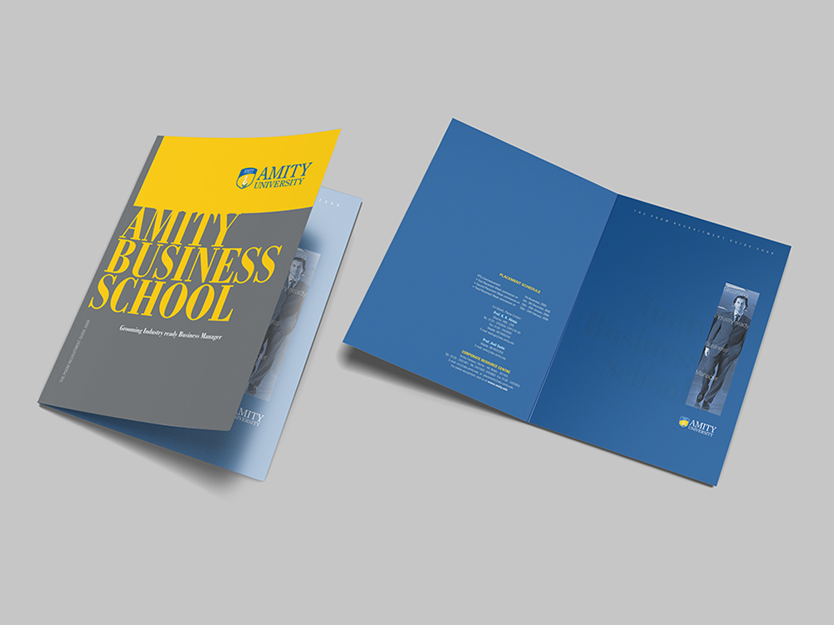
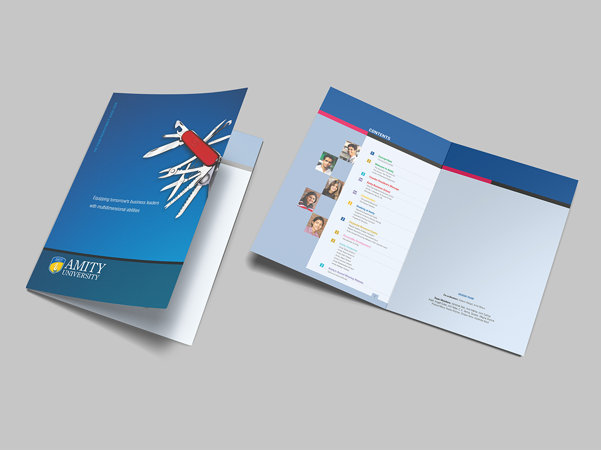
Every institution begins with an idea. The strongest ones grow into a legacy.For Amity University, Studio Clarion developed the original identity around a flame symbolising knowledge, ambition, and the pursuit of excellence. Subtly integrating the letterforms A and U, the mark was designed to capture the energy of young minds while creating a distinctive and enduring academic presence.
“We Nurture Talent”
It became the guiding thought behind the brand, positioning the university as a place where education extends beyond academics to nurture potential, leadership, and ambition. The idea shaped a visual language that balanced institutional credibility with the optimism and energy of a growing university
Developed the original university identity and academic visual language
Created communication across campaigns, institutional films, brochures, print systems, and academic collateral
Built a flexible identity system designed to grow with the institution over time
Established a consistent visual language across admissions, institutional communication, and brand outreach
From institutional films and photography to brochures, campaigns, publications, and academic communication, the identity was carried across every stage of the university's growth. Built on a strong symbolic foundation, the system has continued to evolve while retaining the clarity and recognition of its original design. The result is an identity that continues to represent one of India's most recognised educational institutions while remaining true to the idea on which it was first built.