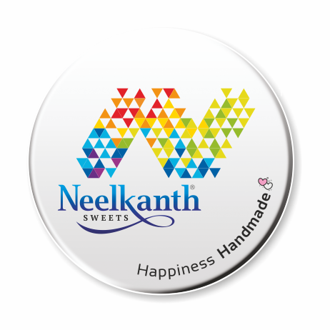
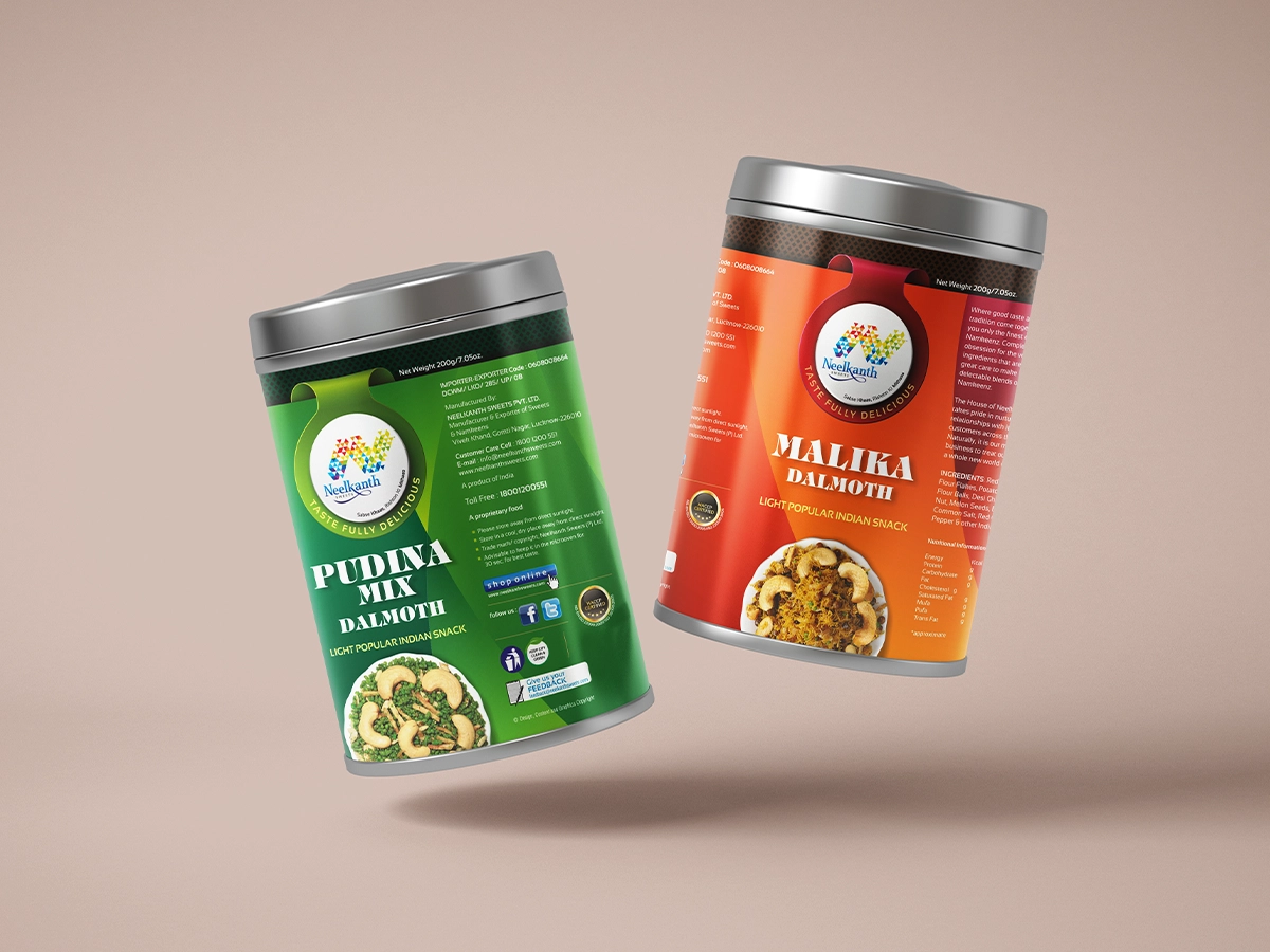
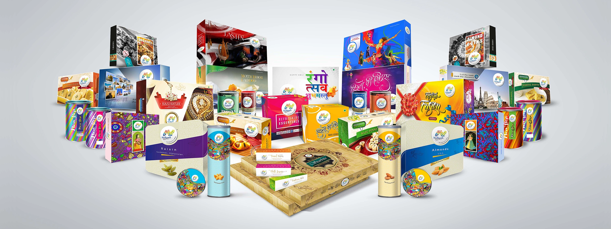
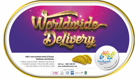
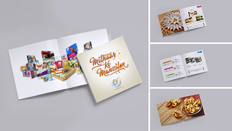
The identity for Neelkanth Sweets was built around a geometric interpretation of the letter "N", reflecting the diversity, vibrancy, and celebratory nature of Indian culture. Constructed from interlocking forms and colours, the mark creates a distinctive visual language that has remained relevant as the brand evolved from a single outlet into a multi-location business with an international presence. One of Studio Clarion's longest-standing associations, the relationship has continued for over 32 years.
"Happiness Handmade"
In a world increasingly shaped by automation, Neelkanth continues to value craft, warmth, and the human element behind every experience.
A thoughtfully constructed brand system that translates insight into a lasting identity
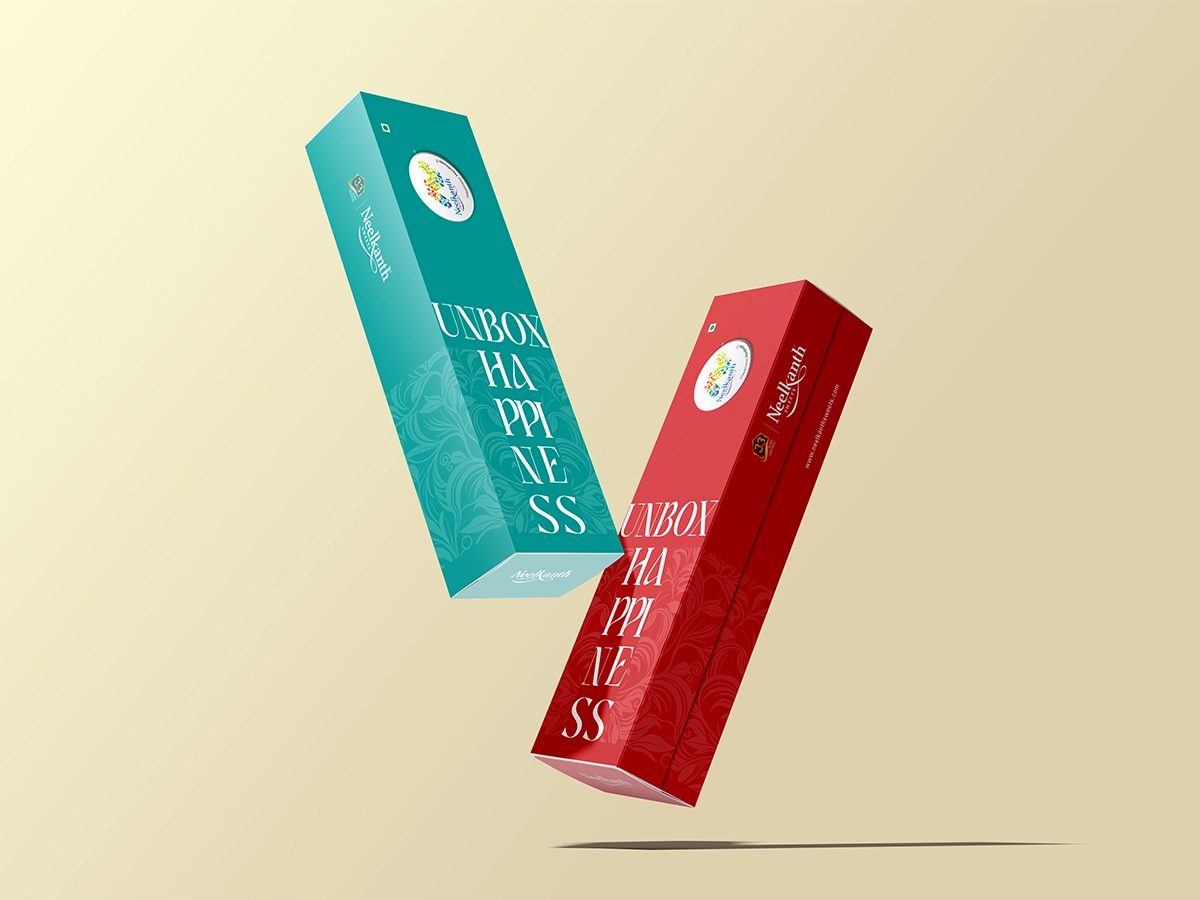
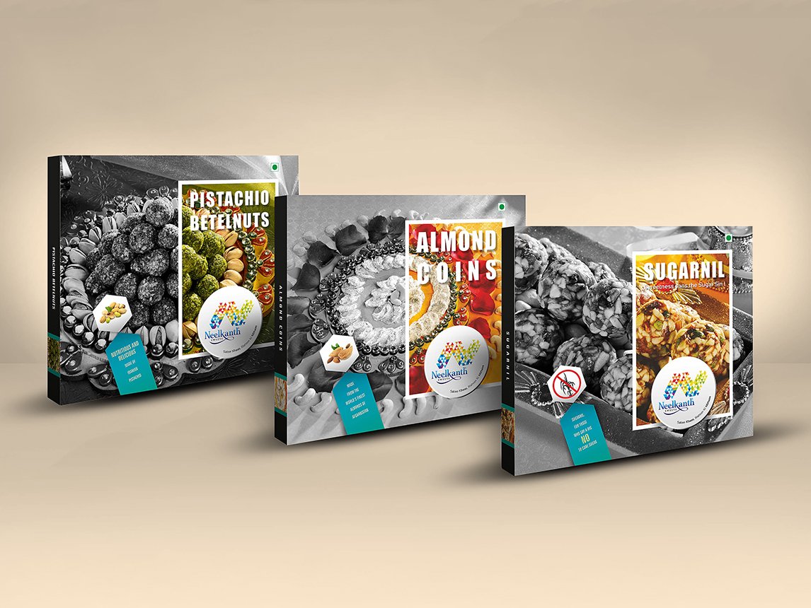
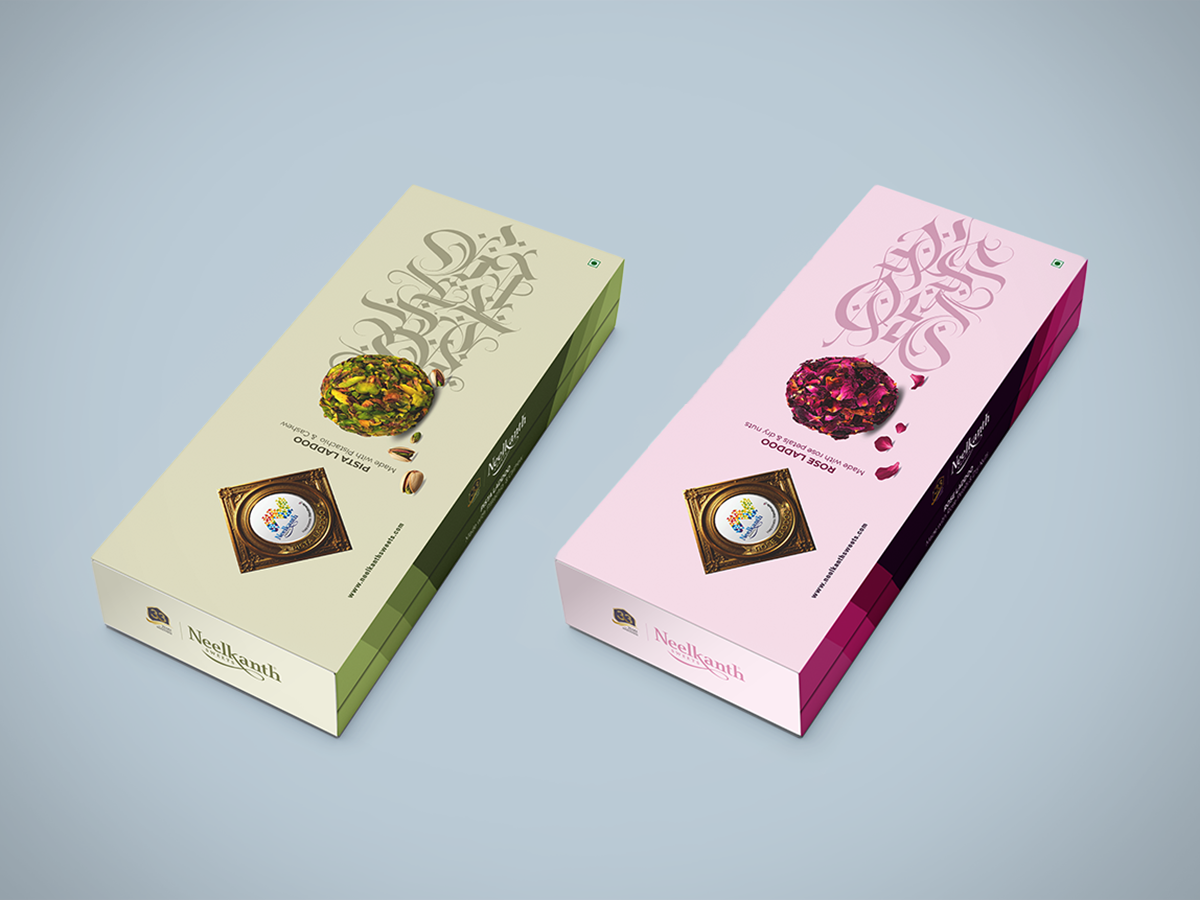
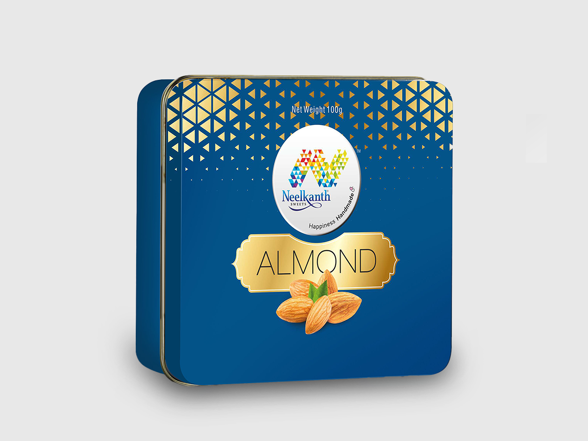
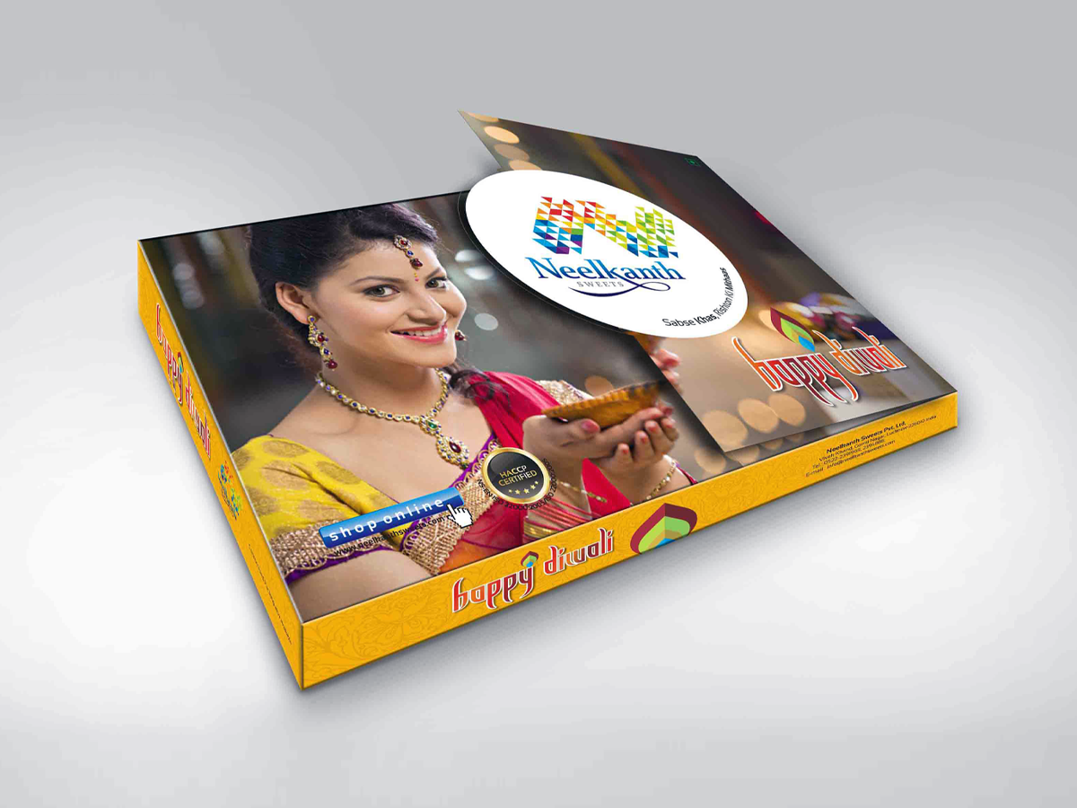
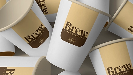
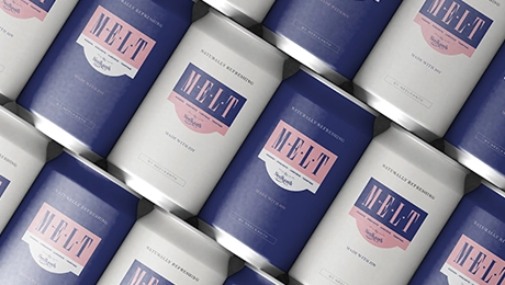
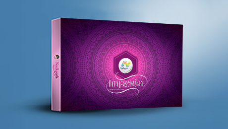
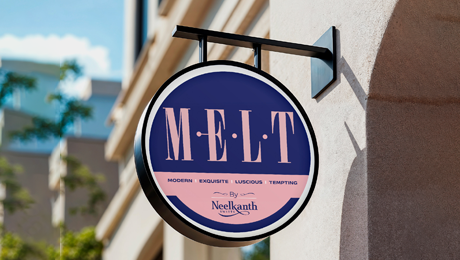
Adaptive expressions across packaging, retail environments, and multi-format media
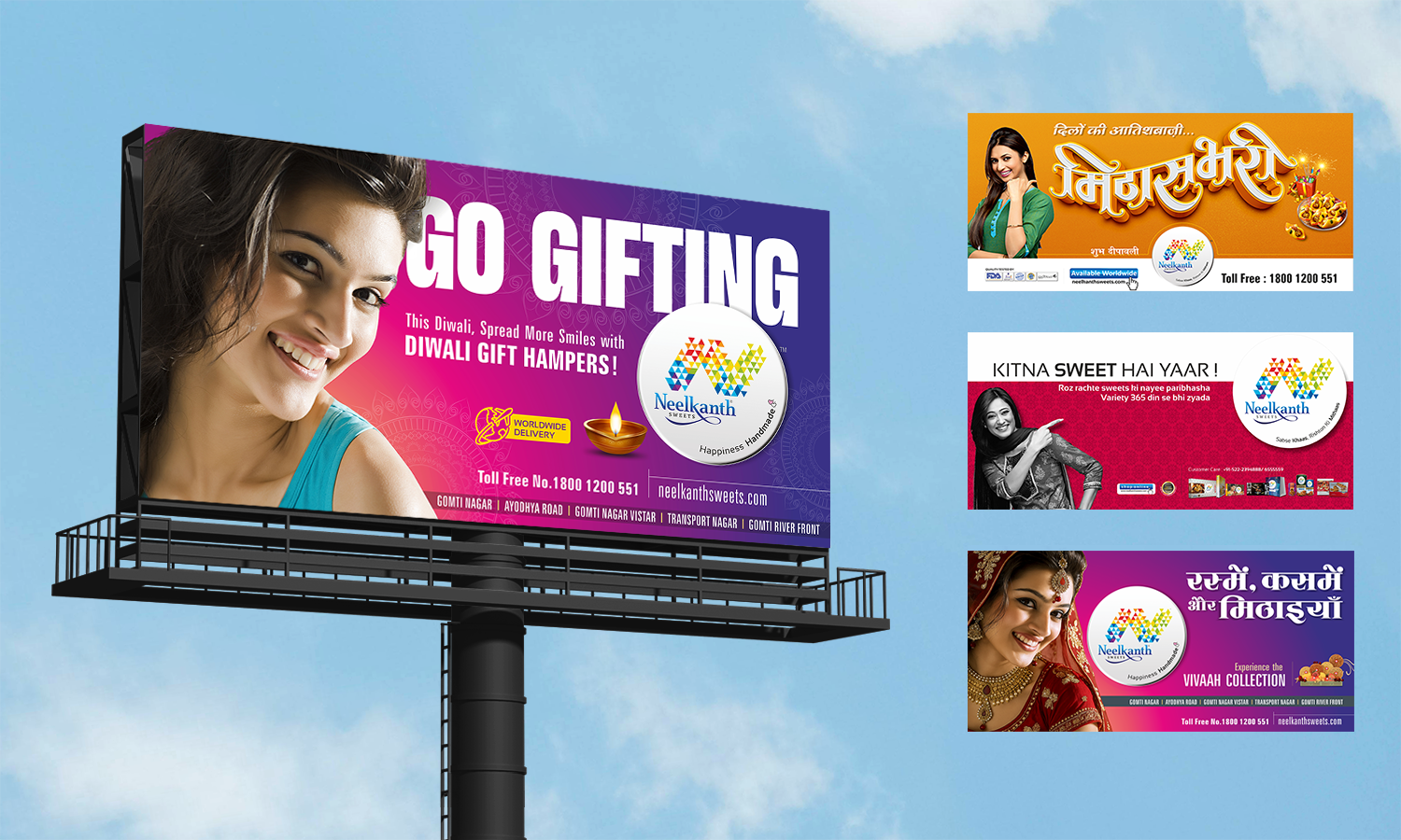
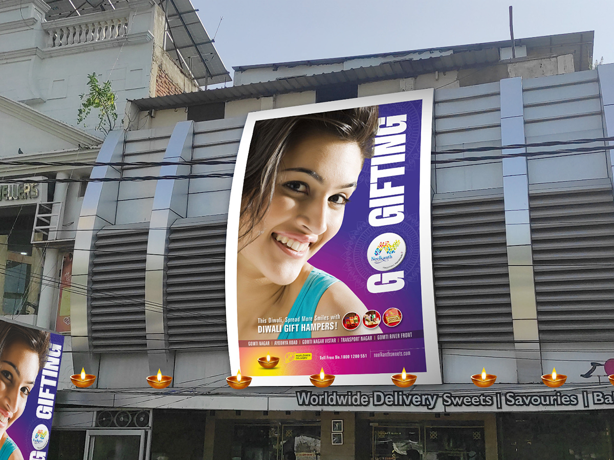
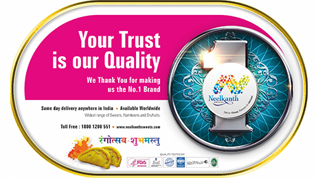
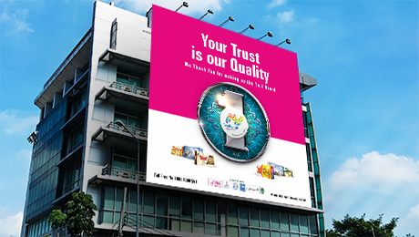
Visibility-led campaigns across hoardings, transit, and public presence
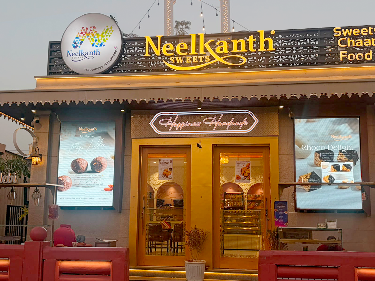
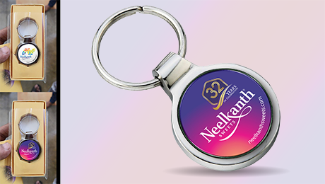
Spatial storytelling across storefronts, interiors, and immersive environments, extending into merchandise and production-ready formats
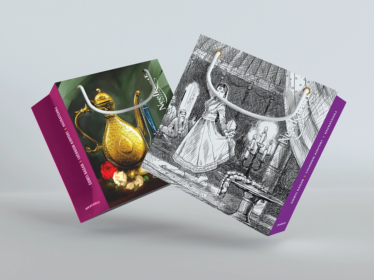
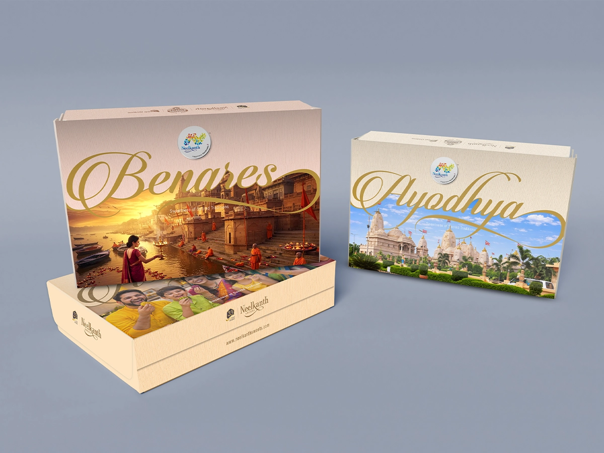
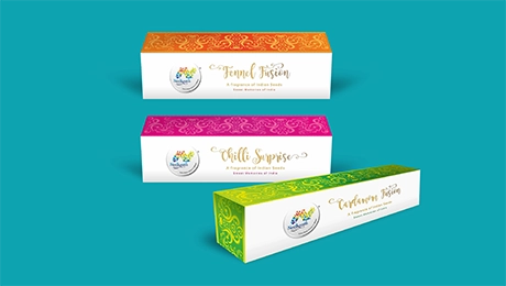
Extending across packaging, retail environments, communication, and outdoor media, the brand was developed as a unified visual system. Packaging in particular became a storytelling medium, drawing from cultural landmarks and regional narratives through detailed illustrations and gold calligraphic accents that carried a strong sense of place and identity.