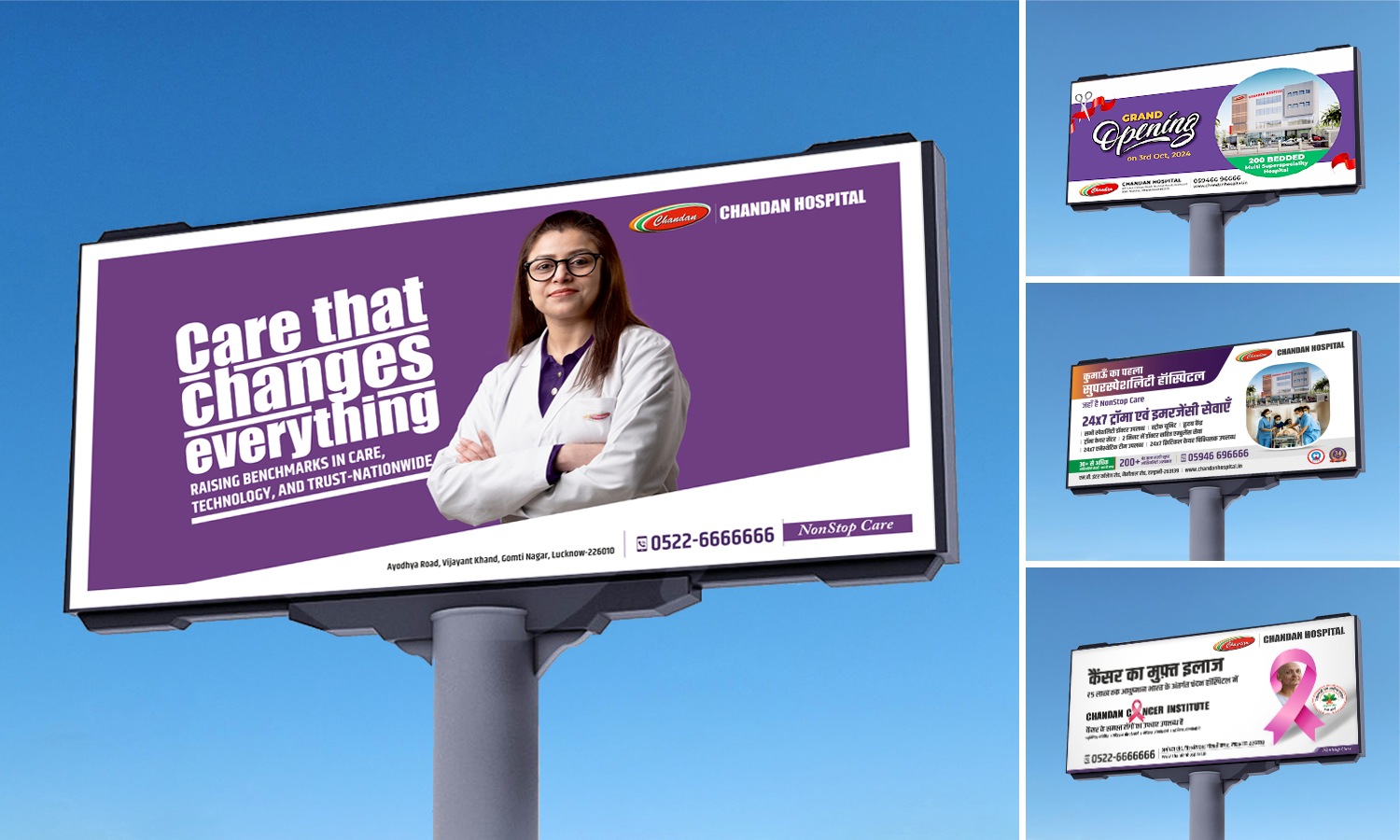
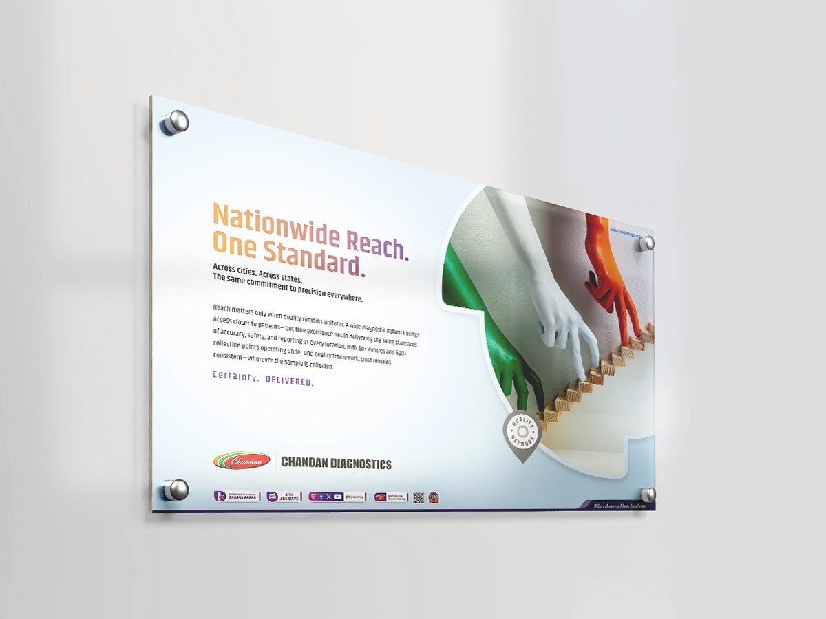
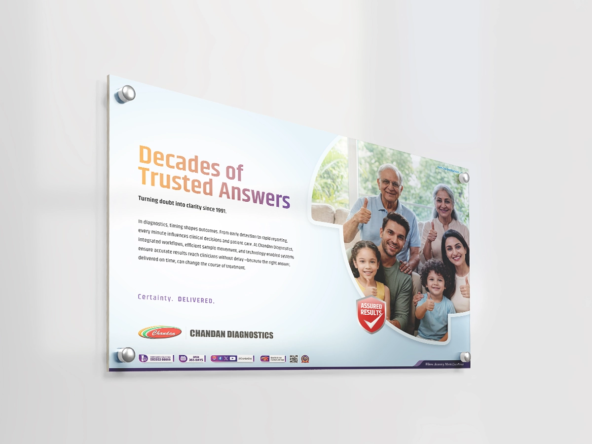
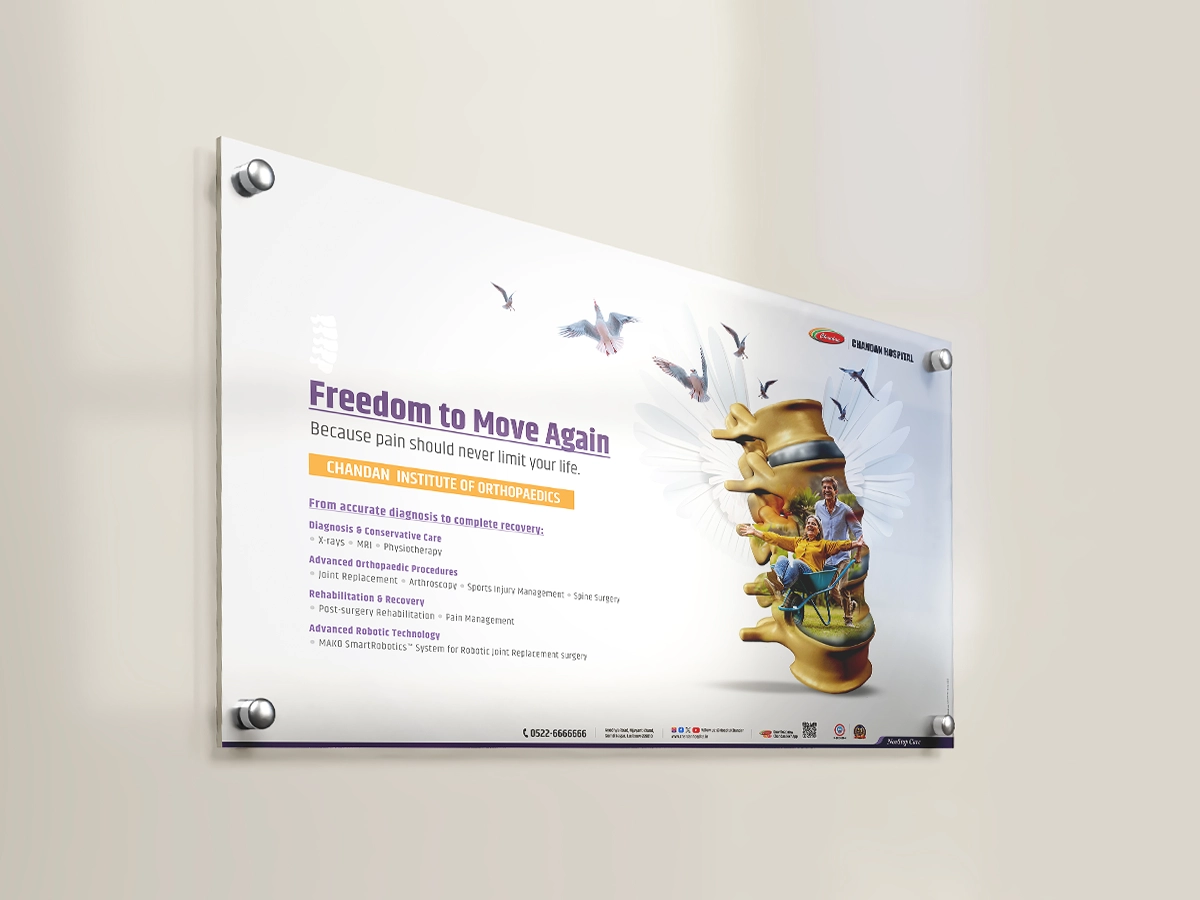
Built on over three decades of trust, Chandan group has grown into a diverse healthcare network spanning hospitals, diagnostics, pharmacies, and medical centres. The identity was refined to align with this growth, creating a more structured and recognisable brand system. Anchored by a distinctive purple, the visual language brought consistency across verticals while strengthening recognition across the network.
"Non-Stop Care"
It emerged as the central brand idea a simple expression of care as an ongoing commitment rather than a moment of treatment. It provided a clear foundation for communication while unifying an expanding ecosystem under a shared narrative.
Comprehensive brand guidelines established a structured framework that extended across hospital environment.
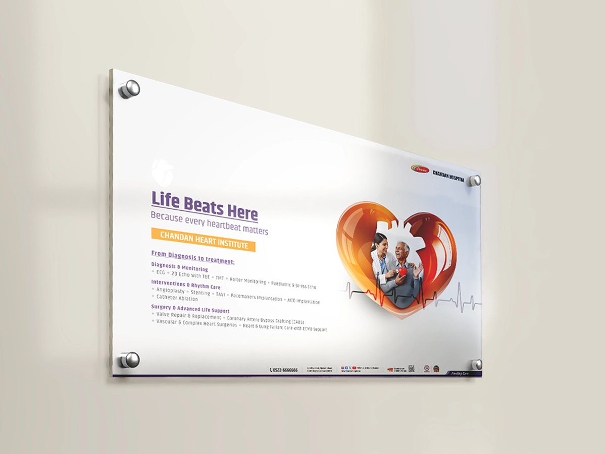
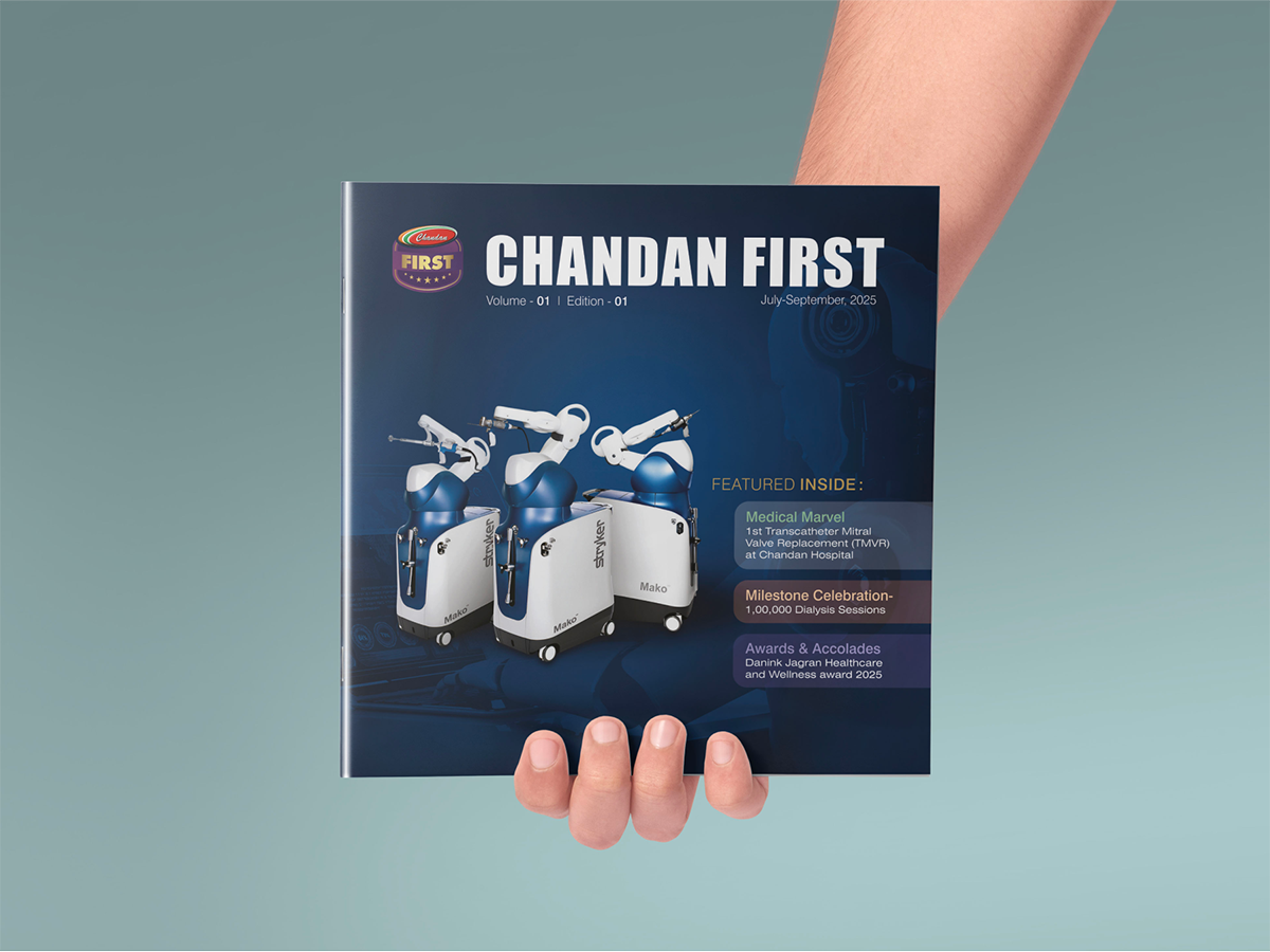
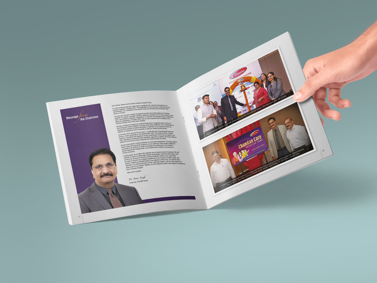
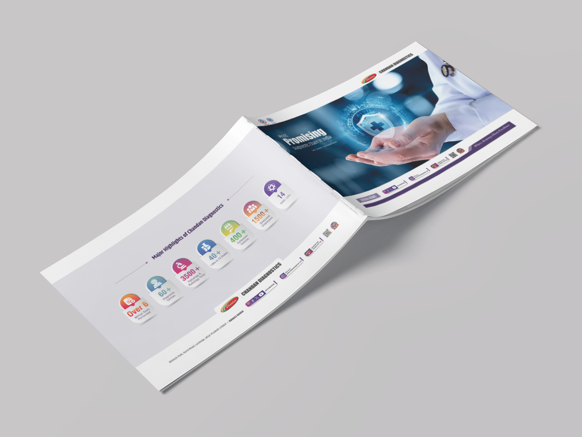
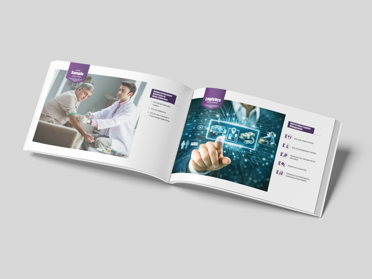
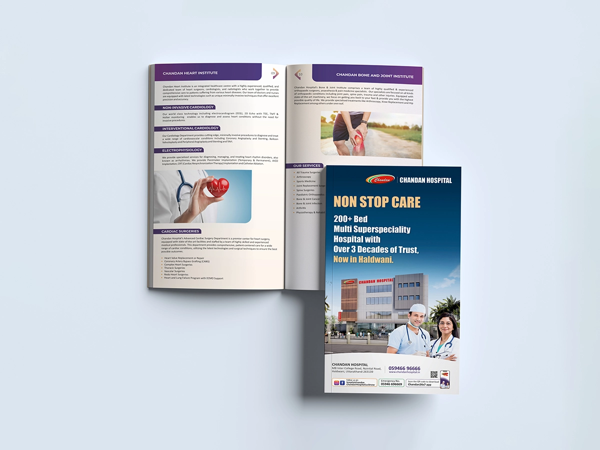
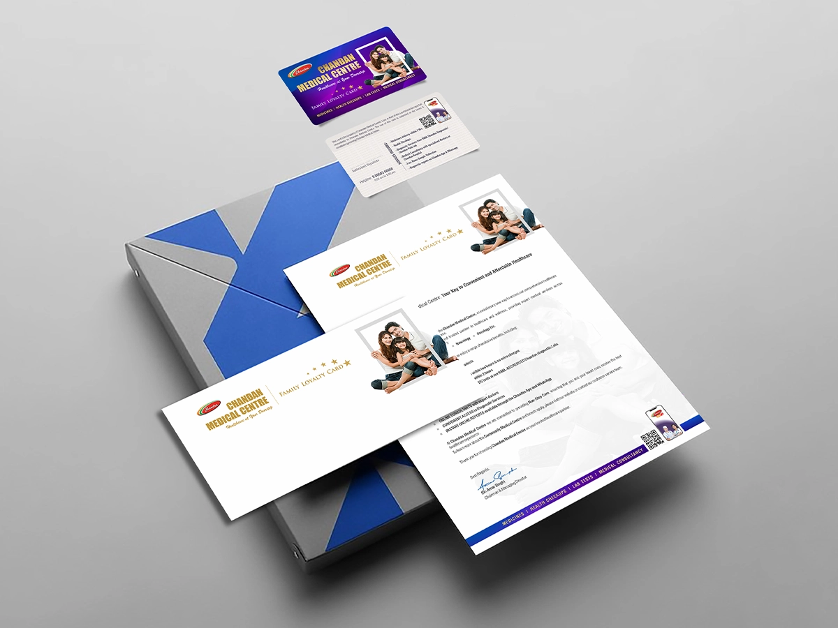
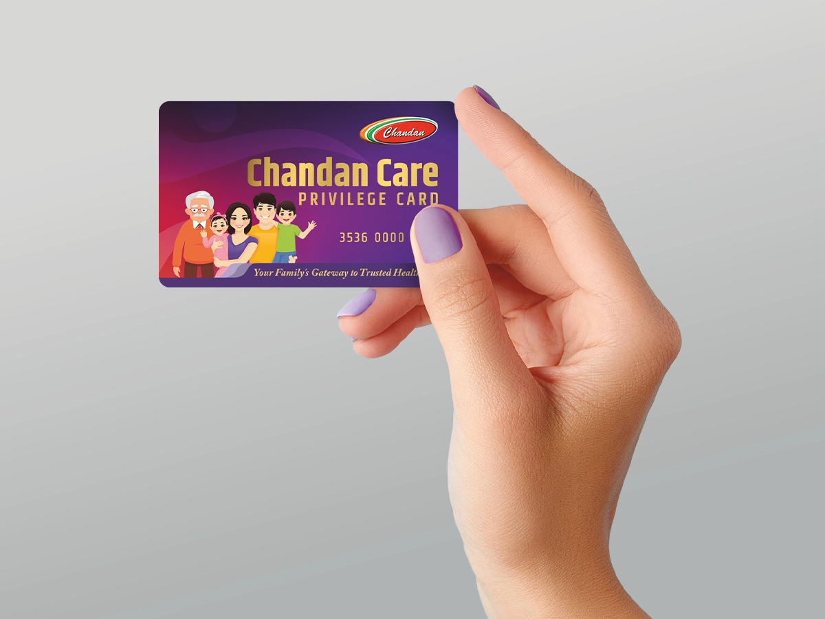
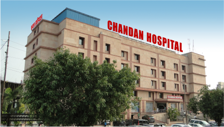
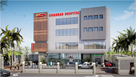
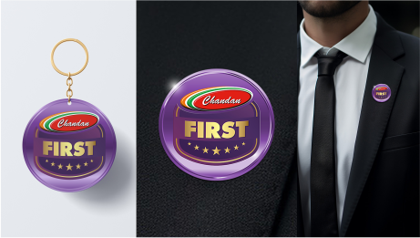
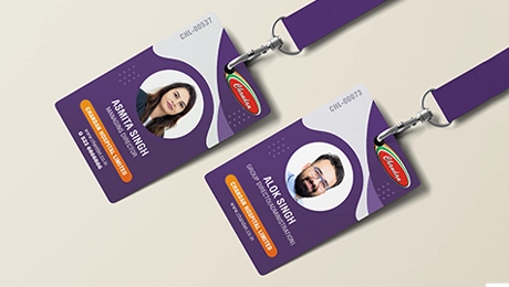
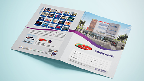
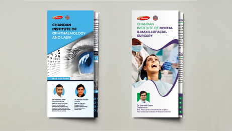
A structured brand system extended into the hospital environment, including the 400+multi-super speciality launch at Haldwani, privilege cards, stationery, brochures, publications, and healthcare verticals.
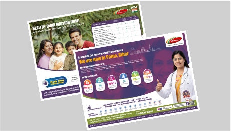
A unified visual language carried across privilege cards, stationery, brochures, editorial publications, and healthcare verticals
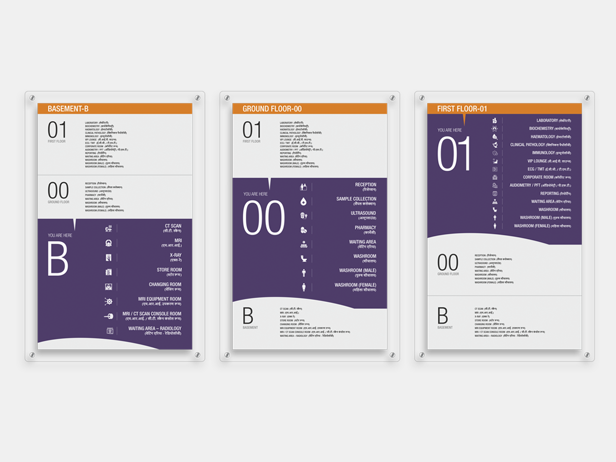
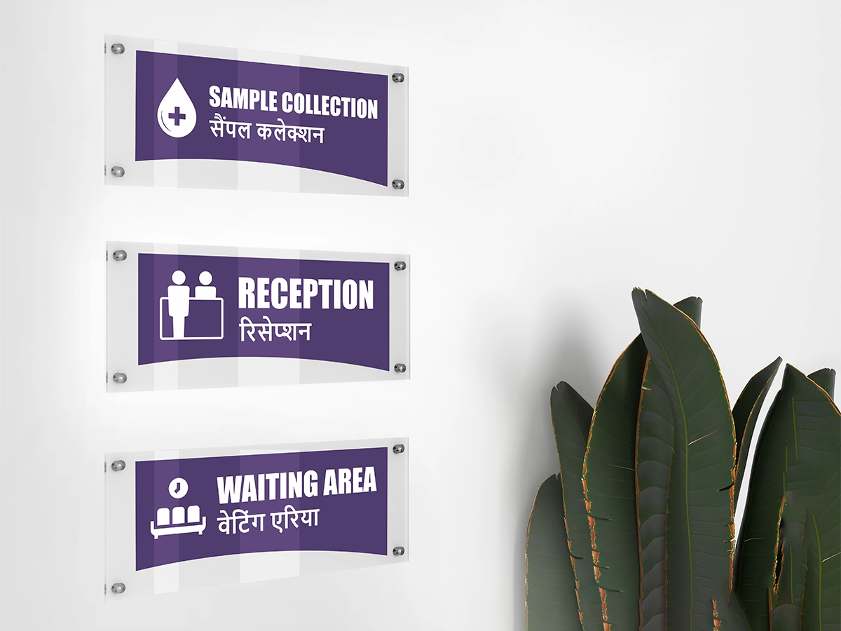
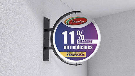
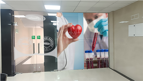
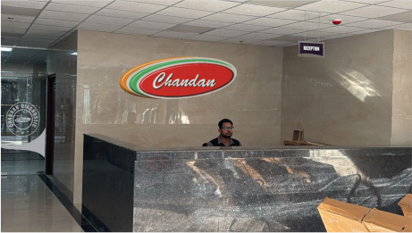
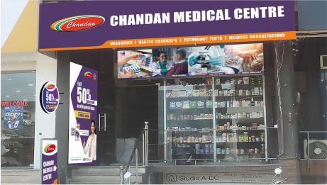
The visual system extended into the built environment through architectural branding, signage, and environmental graphics, creating a syncing presence across hospitals, diagnostics, pharmacies, and medical centres.
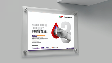
Our scope covered the entire ecosystem from brand guidelines and concept-led campaigns to outdoor visibility, spatial branding, signage, pharmacy, ambulances, and print communication. Implemented across 60+ centres in 16 states, the system was built to reflect the brand’s core belief that care does not end at treatment, but continues beyond it creating a more connected, reassuring, and human healthcare experience at every level.