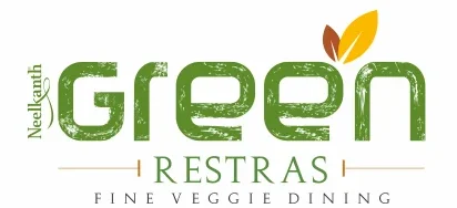
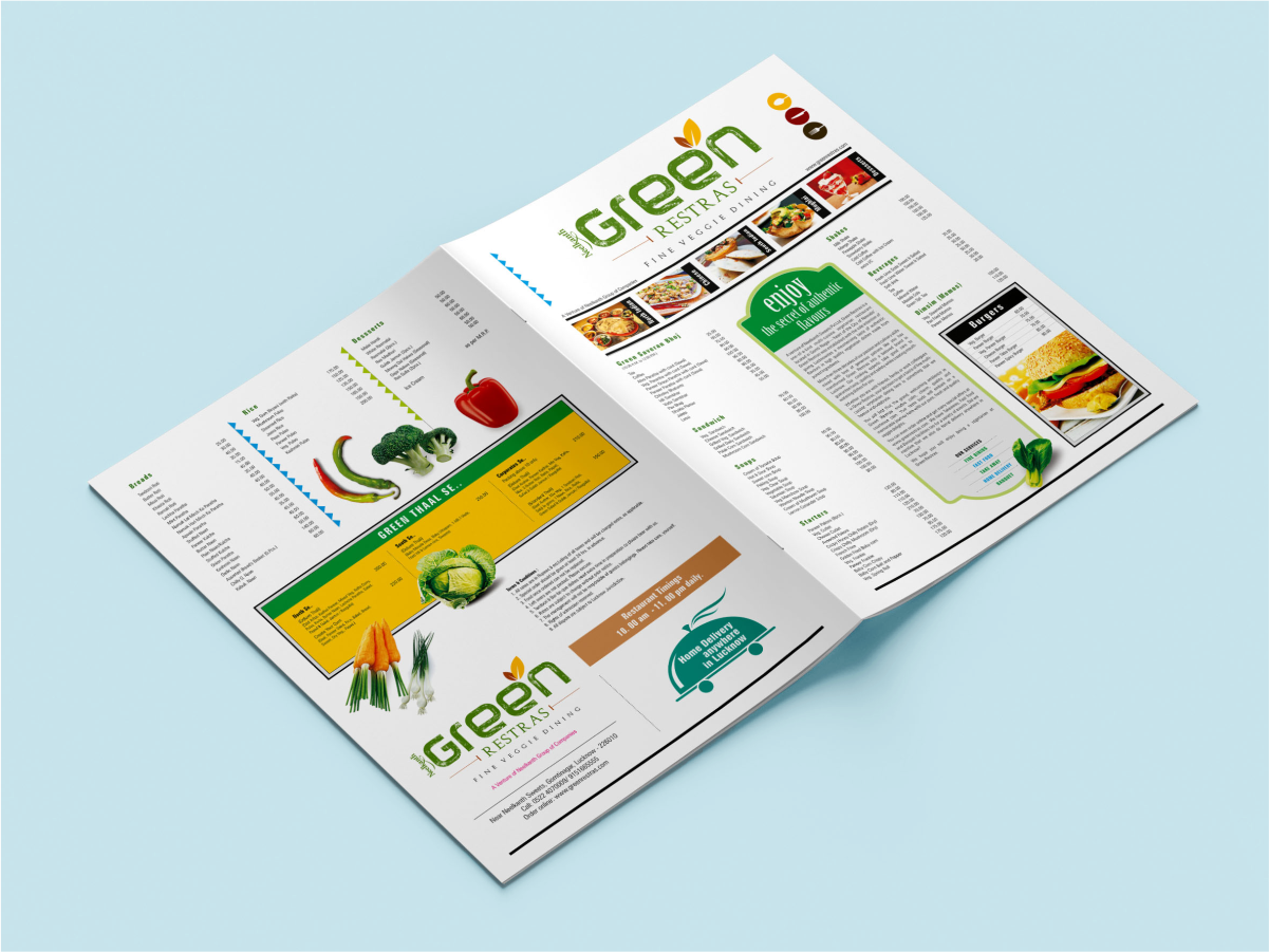
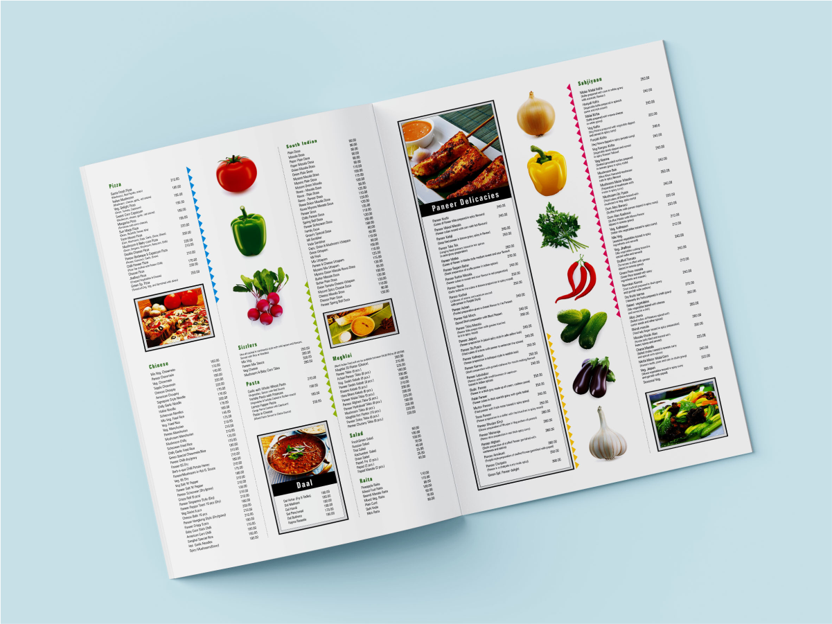
The brand was built around a simple and instantly recognisable idea: green. More than a colour, it became a symbol of freshness, purity, and a distinctly vegetarian dining experience. Studio Clarion developed an expressive brush-textured identity that brought a sense of craft and abundance, creating a contemporary extension of the Neelkanth legacy.
The Colour of Freshness
Green became the defining idea behind the brand, shaping a visual language rooted in freshness, natural ingredients, and vegetarian dining. The identity combined vibrant food imagery, expressive textures, and clean typography to create a distinctive and memorable presence.
Developed the visual identity and launch communication
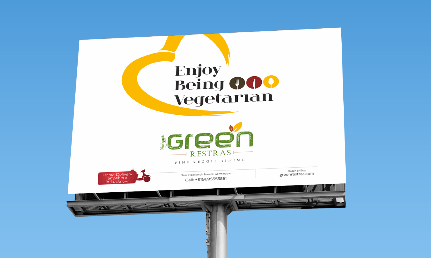
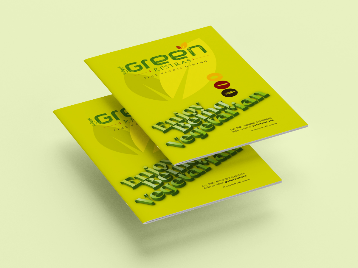
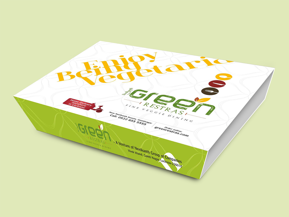
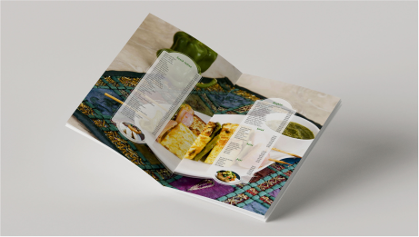
Designed menus, brochures, restaurant graphics, and outdoor campaigns
Created a brush-textured logo system inspired by freshness and handcrafted quality
Built a food-led visual language through photography and ingredient-inspired graphics
From menus and restaurant interiors to launch communication and outdoor media, the identity was applied consistently across every vertical. The result was a contemporary vegetarian dining brand that built on the trust of the Neelkanth name while establishing a fresh identity of its own.