Client

TravelBees

Overview

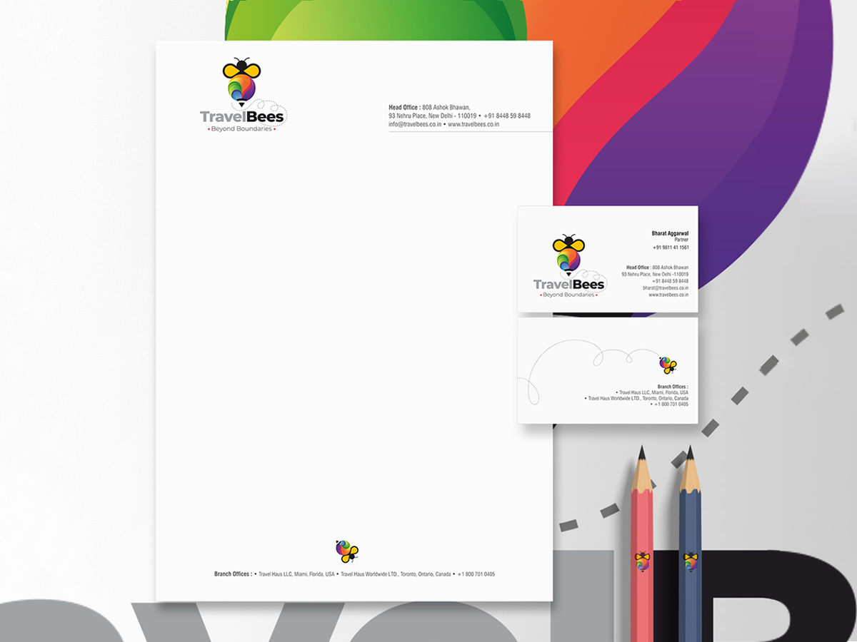
Exploration has no boundaries neither should a brand, for TravelBees, Studio Clarion developed an identity inspired by movement, curiosity, and discovery, creating a visual language that reflects the diversity of people, places, and experiences encountered along the way. The bee became a symbol of purposeful movement and curiosity, while a vibrant palette reflected the diversity of cultures, landscapes, and journeys that make travel meaningful.
Beyond Boundaries

The thought became the foundation of the brand, positioning travel as an experience shaped as much by discovery as by destination. Every element of the identity was designed to express movement, possibility, and the excitement of exploring what lies beyond the familiar

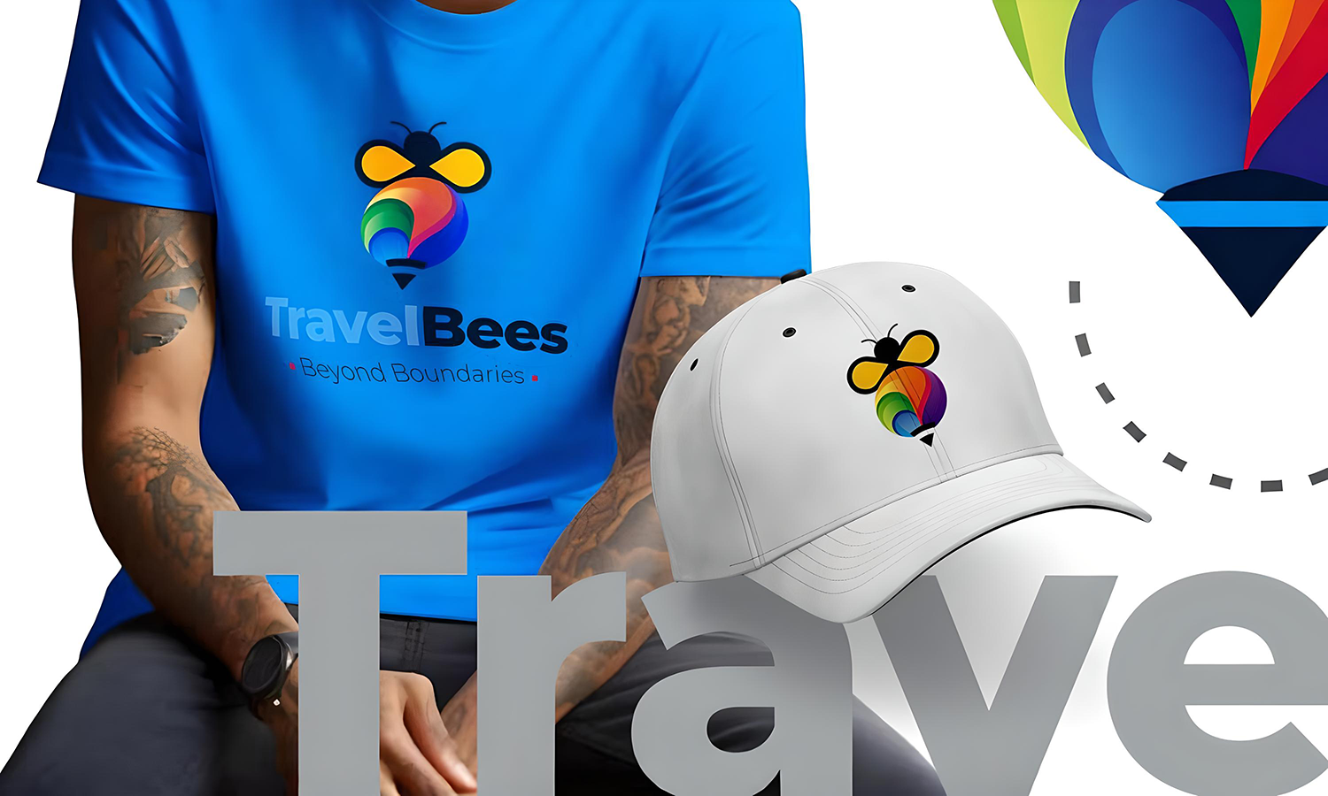
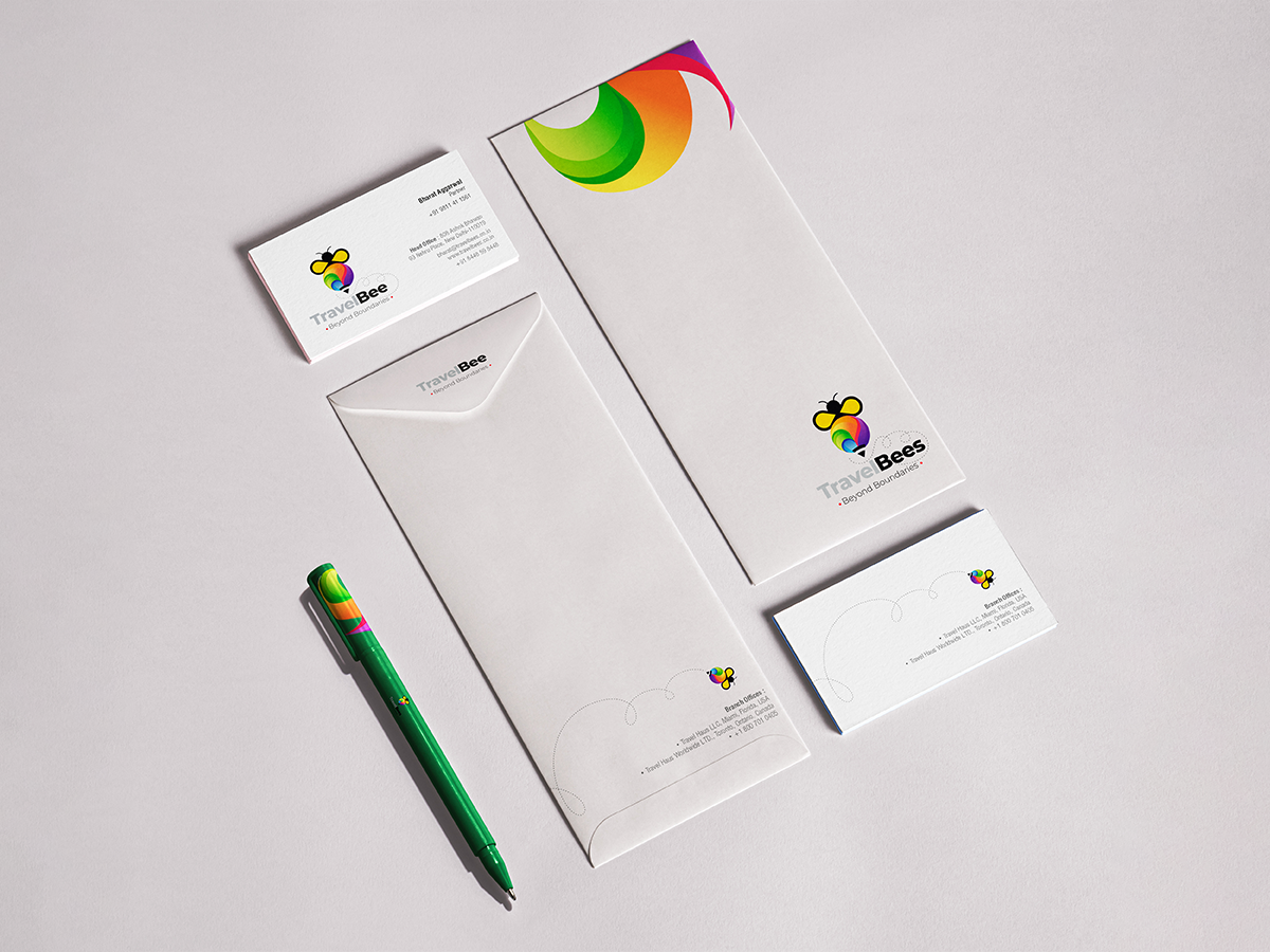
The visual language extended across brand communication, stationery, merchandise, and motion graphics, creating a cohesive identity that conveyed energy, curiosity, and exploration. The result was a distinctive travel brand designed to inspire journeys that extend beyond destinations.

Get in touch

error: Content is protected !!