Client

Formosa Decor

Overview

Formosa Decor, Studio Clarion created an identity where every element was defined by balance, proportion, and restraint. Rather than relying on ornamentation, the brand draws its character from refined geometry, thoughtful typography, and a disciplined visual language, establishing a premium presence through simplicity.
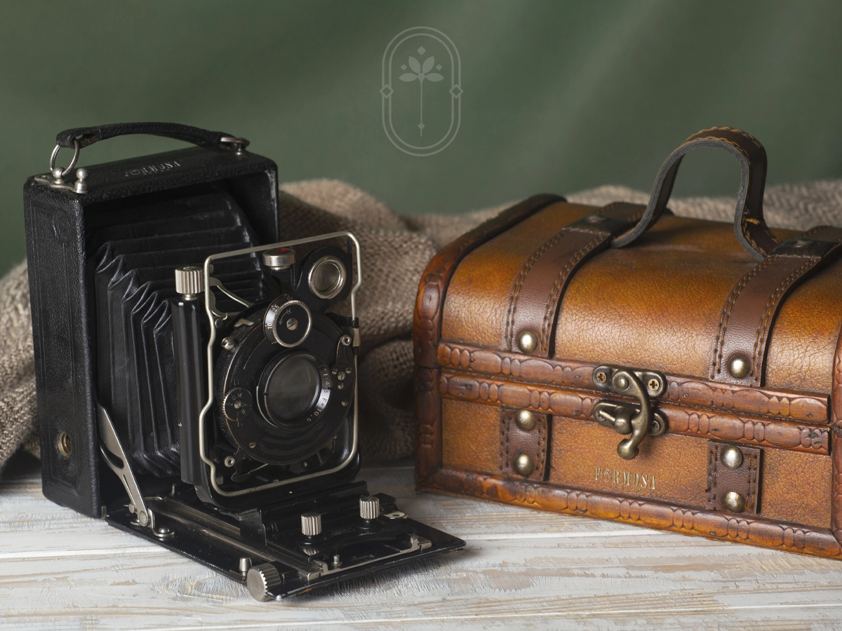
Luxury begins long before the final detail.

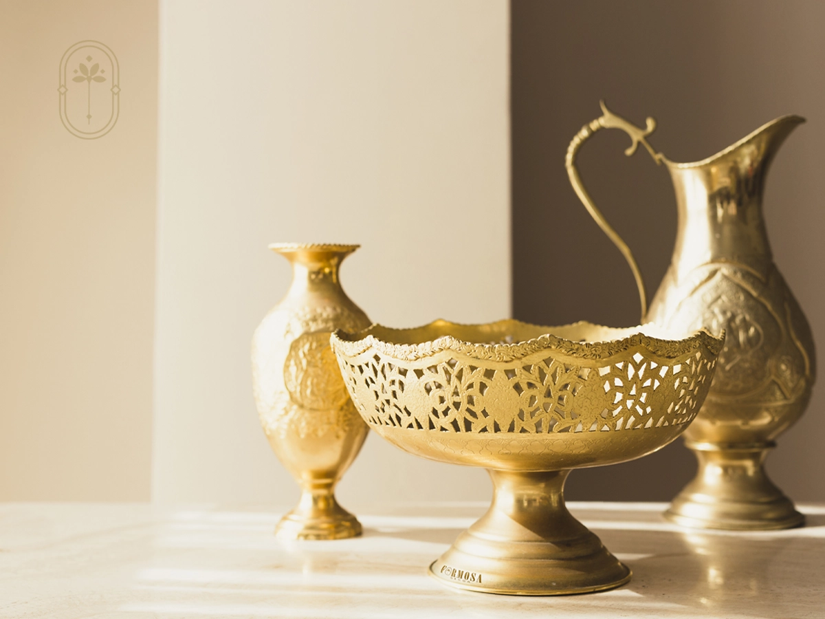
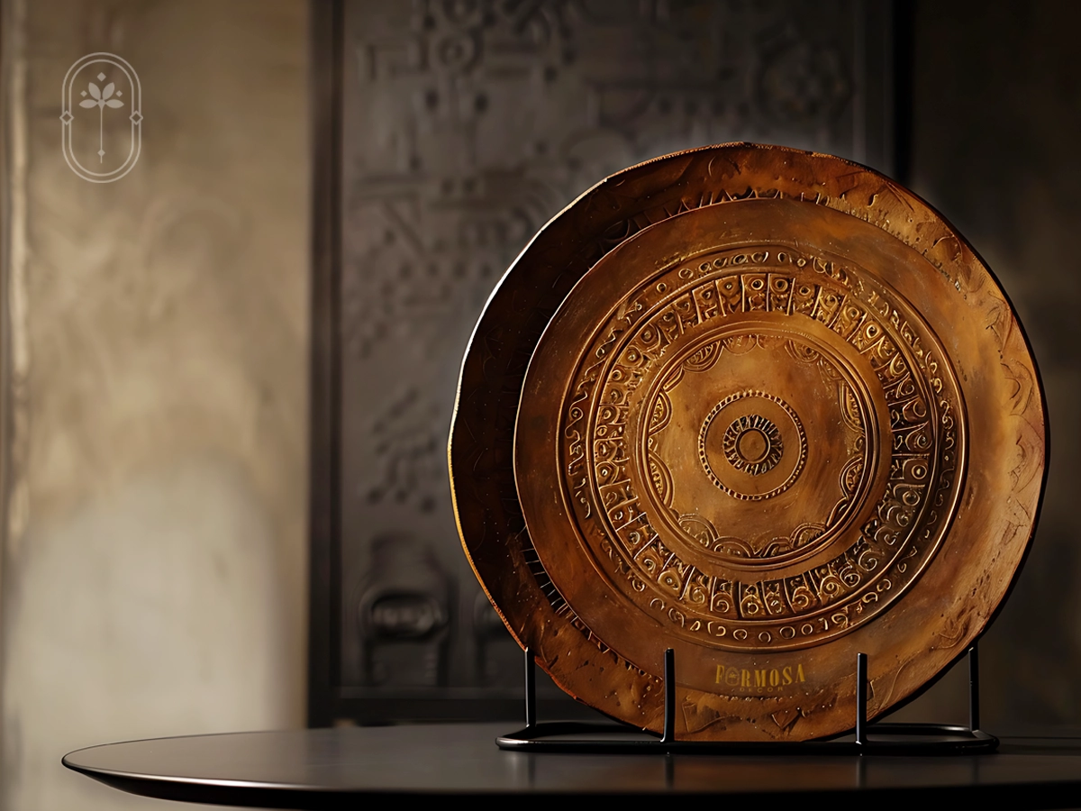
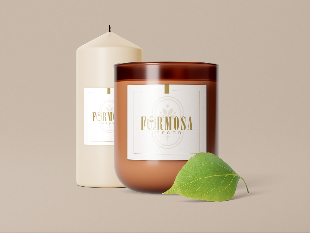
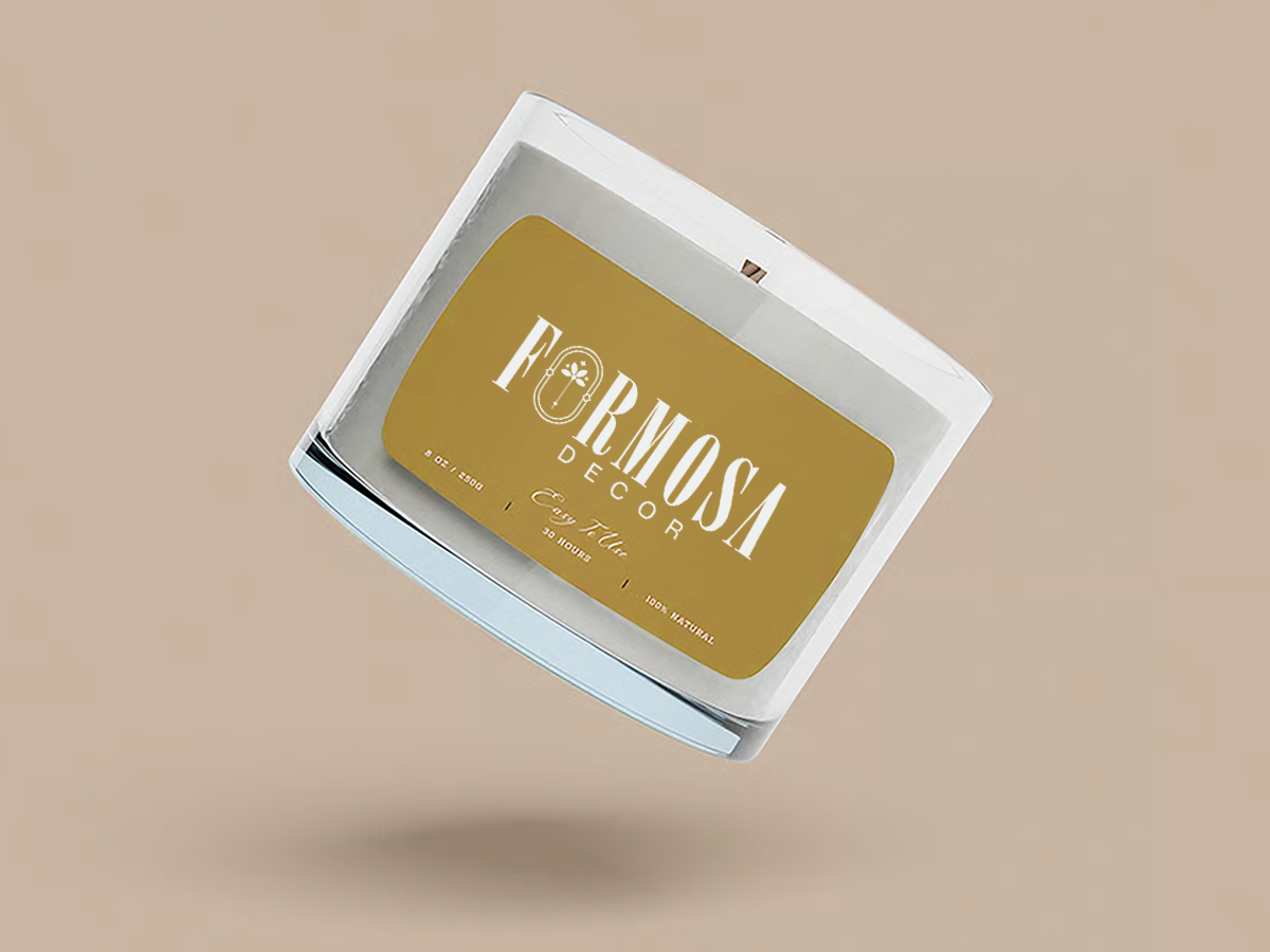
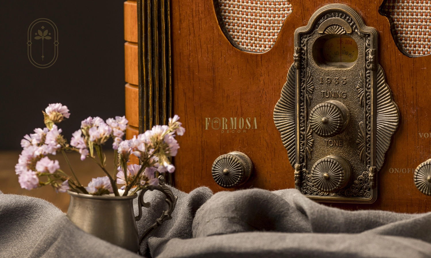
The identity reflects a quiet approach to luxury, where precision becomes the defining expression. A finely balanced logotype, symmetrical emblem, and a restrained palette of deep navy, soft neutrals, and muted gold work together to create a timeless and contemporary brand language.

Every element was resolved with clarity and discipline, from spacing and proportion to material finishes and application. The result is an identity that expresses sophistication through precision, creating a brand that feels understated, confident, and enduring.

Get in touch

error: Content is protected !!