Client

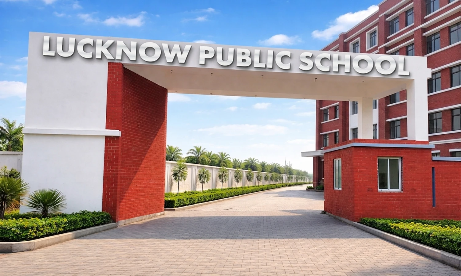
Lucknow Public School

Overview

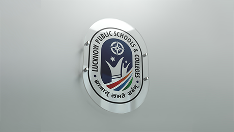
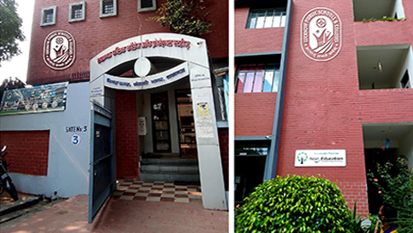
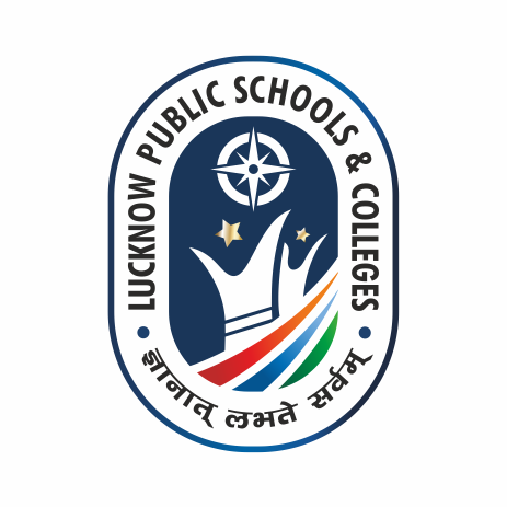
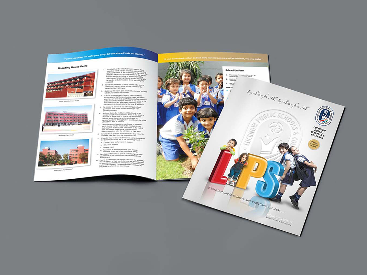
Lucknow Public Schools & Colleges was envisioned as a structured academic identity built to grow with the institution. Studio Clarion developed the logo around the form of the school boundary, refined into a vertical symbol representing continuity, learning, and the journey of every student. At its centre, the relationship between teacher and student is expressed through a single uplifting form, while the compass above signifies direction, aspiration, and a global outlook rooted in Indian values.
ज्ञानात्लभतेसर्वम् (Through Knowledge Comes Everything)

Drawn from the Bhagavad Gita, this philosophy became the foundation of the identity. Its symbolism, typography, and visual structure expressed learning as a journey guided by knowledge, purpose, and the enduring relationship between teacher and student.

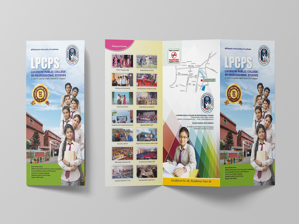
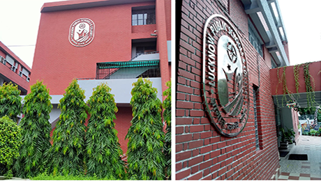
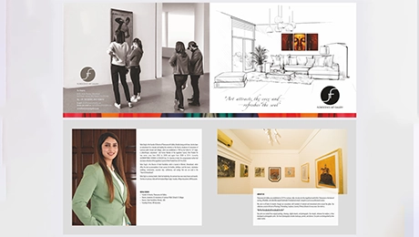
As the institution expanded across 16+ campuses, the identity evolved with it while retaining the strength of its original foundation. Beyond the academic environment, the visual language extended into associated ventures including Joy Bakery, Florescence Art Gallery, and Hotel Harshikhar, creating a consistent institutional presence across diverse environments.

Get in touch

error: Content is protected !!